The Salesforce Reports-To Org Chart You Can Actually Drag Into Shape

Updated: Aug 3
An Account's reporting structure already lives in Salesforce — it's sitting in the Reports-To field on every Contact. Nobody can see it, though. It's just a lookup field, one per record, and understanding how thirty contacts at an enterprise account actually report to each other means opening each one individually and piecing it together in your head, or in a spreadsheet if you're being careful.
And when the structure changes — a reorg, a new department lead — updating it means editing contacts one at a time, hoping you don't lose track of who reported to whom before you started.
A tree you can see, and reshape by dragging
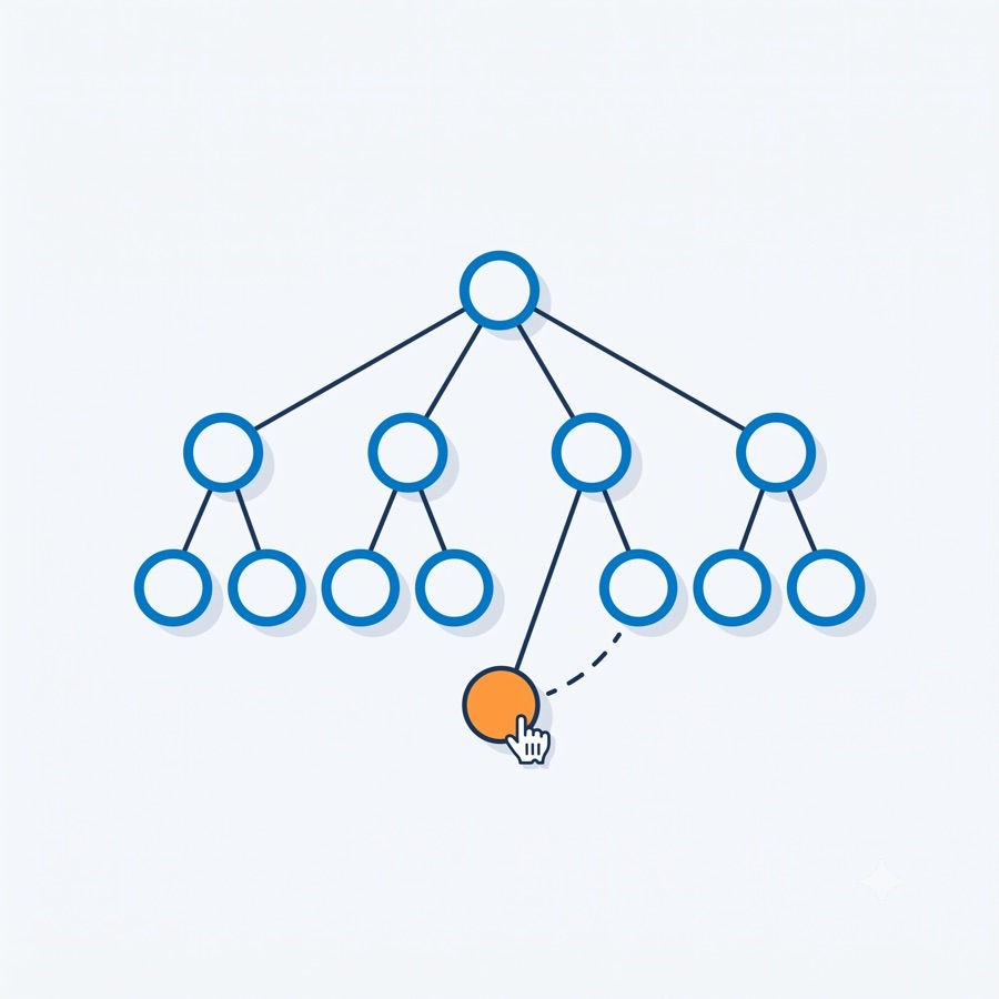
Account Org Chart, included in Power User Toolkit, is a Salesforce Reports-To org chart that renders an Account's contacts two ways:
Tree view, built from the Reports-To field, showing the actual reporting structure at a glance.
Kanban view, grouped by department, for when you're thinking about org structure by team rather than by hierarchy.
Both are editable directly. Drag a contact onto another to change who they report to. Drag a card into a different Kanban column to change their department. Both save immediately — no separate edit screen, no navigating to the record.
The canvas supports zoom and pan for larger accounts, a live search to jump straight to a contact, and keyboard navigation through the tree. If the underlying data has a reporting loop — a data quality issue that happens more often than you'd expect — it's flagged with a warning and broken automatically so the chart still renders instead of hanging.
Where the Salesforce Reports-To Org Chart Lives
This is an opt-in component: an admin adds it to an Account or Contact page layout in App Builder and grants the included permission set for it. It's not turned on by default, which means it only shows up where you actually want it — most likely the Account record page, next to the contact list it's built from.
Who this is for
Sales and success teams working enterprise accounts, where understanding who reports to whom actually matters for navigating a deal or a renewal. Instead of a stale org chart in a slide deck, it's live, editable data that stays as current as the last drag.
For the rest of the productivity tools in the toolkit, see Stop Guessing When You're Free: Finding Open Time Slots in Salesforce and How to Actually Read Your Salesforce Event Monitoring Logs. Or start at the Power User Toolkit overview.


Comments